
In recent times, more and more people those who opt for bright and intense colors when decorating their kitchens. Therefore, it is not uncommon to see kitchens in colors such as yellow, red or green. It is a way to bring energy and vitality to one of the most important areas of the house.
In the following article we talk about those bright and intense colors that you can put in the kitchen and achieve a wonderful decoration in this way.
BLUE
Blue is a color that is trending in kitchen decoration. It is a tone that is reminiscent of the sea and that brings a lot of elegance to the decoration of the room. The good thing about a color like blue is that you can combine it with other types of colors or use it in a monochromatic way. You can choose to decorate your kitchen inclusive of blue if it is quite spacious and has a lot of light from outside.
Very peri
Very Peri is the color of the year and it is a shade that is halfway between blue and a purplish-style red. It is a shade that will bring joy to the kitchen as well as a lot of freshness. Very Peri is a color that combines perfectly with white and other more neutral tones. If you opt for this kind of color you will help the kitchen have a great feeling of spaciousness and seem quite bright.

Yellow
One of the most intense colors for the eye is yellow. If you are a daring person and you like the modern do not hesitate to use the color yellow when decorating the kitchen. As it is a fairly intense and striking shade, it is advisable to use it moderately and without overdoing it. During these months you can choose the yellow sun and use it in the kitchen furniture or in some of its accessories.
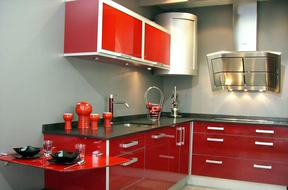
RED
In recent years the color red is one of the most used when decorating home kitchens. It is a color recommended for people who want to give a radical twist to the decoration of the kitchen. Red brings energy and vitality in equal parts. As with yellow, it is not advisable to abuse red and use it in a moderate way. Depending on the dimensions of the kitchen and how spacious it is, You can use it on furniture, accessories or on the walls.
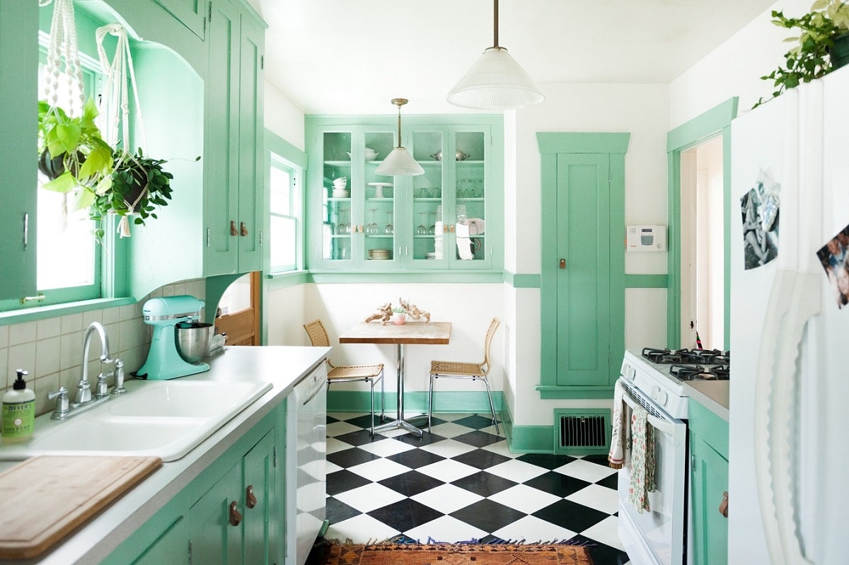
Verde
Green is a perfect shade to decorate the kitchen, especially if you want to achieve an elegant touch as well as a natural one. If you want to break with shades such as white or beige and achieve a different decoration that evokes nature, do not hesitate to choose the color green. It is a tone that will combine perfectly with other colors such as white and with natural elements such as wood.
Pastel colors
Apart from decorating the kitchen with bright and intense colors, it is advisable to do it with different pastel shades. These types of shades are the ones that triumph this year, especially in the first half of the year. In this way, pastel-type yellow, green or blue tones will help you give the kitchen a warm touch and create a really cozy space. Pastel tones are perfect and ideal for creating a flirtatious and sweet style in the kitchen.
Kitchen accessories with bright colors
Many people do not dare with bright and intense colors when decorating the kitchen at home. Opting for this type of colors means leaving behind the traditional and the classic in the face of greater daring in terms of decoration. It is not the same to use colors as traditional as gray or white as to choose colors as intense as red or yellow. If you want to give the kitchen an important note of color but without going overboard, you can use some striking hue in the accessories of the room. There is nothing wrong with using colors such as blue or yellow in decorative elements of the kitchen such as fabrics or kitchenware.
In short, many people opt for bright and intense colors when decorating the kitchen and get in this way to give a twist to the stay. These colors are perfect when it comes to getting a modern decoration as well as current. If you consider yourself a daring person, therefore, do not hesitate to decorate the kitchen at home with one of the colors seen above.