
When we decorate our house or our office or workplace we always think of colors. Colors are the soul of decoration and they can drastically change the atmosphere of an environment.
You may think that brown and blue are colors that, together, do not combine much or do not result in a very attractive combination... but try placing them side by side and you will see how well they look. For example, let's look today at options for creating a living room decorated in a combination of blue and brown.
Use blue and brown in the decoration of the living room
It's a color combination very stylish and ideal for decorating living rooms, precisely. Why? because it turns them into very harmonious spaces. Depending on the shades of blue and brown that you choose, you can decorate in Different styles, from a modern one, going through a XNUMXth century style, or a style without time or something industrial. And yes, actually, although we are talking about decorating today a living room in a combination of blue and brown Well you can decorate any space with these colors.
Shades of brown are mainly used for walls, floors, and furniture.While blues can be added here and there to harmonize. A room in blue and brown will create a livelier room and even the smallest room will look beautiful and stylish.
For many interior design specialists brown is the new black. Will it be so? Honestly speaking, nothing can replace black when it comes to classic style, but since brown is a neutral color, we could say that pretty much goes well with any other, so that's why it has become a popular friend of blue.
Also, do not forget that both colors are naturally neutral colors and that one represents the sky and the other the earth, so it is true that have a naturally calming, relaxing effect, something that is always good in a house. It is a way of bringing nature into the house, the spirit of the sand, the sea, the forest and the sky. After all, our home is a private space where we want peace, where we get away from the madding crowd.
So, do you already want to paint the living room in blue and brown? I add some reasons more to make your choice. In principle, when light shines on a piece of furniture or decorative object, that thing absorbs every color in the spectrum except one, which is the color that we ultimately see. Because blue has a very short wavelength it evades absorption and is therefore the easiest color to observe (which is why the sea usually appears blue or why we sometimes cannot distinguish between dark blue and black).
Science aside, the important thing is that blue is a cool color for interior spaces, especially in dark spaces because injected with light and color that space in question. And if there is a lot natural light, blue makes the room shine. And if there are no windows, blue will naturally give a light and color to the room that is dark.

Blue rooms, in this case the living room, are good for your health. Seriously, it has been shown that a blue space lowers blood pressure and heart rate. Studies say, it seems that a lot of studies, that if a person inhabits a blue space it helps them to deal with the most depressive aspects of daily life. And yes, it also helps a lot to sleep well.
Blue color neutralizes melatonin levels (the hormone that anticipates the darkness of the night), and that means that it is a refreshing and energizing color when we have low melatonin in the morning. At the same time it is also a soothing and relaxing color at night when melatonin is high and we are trying to sleep. That is why, in addition to living rooms, blue is a color widely chosen by interior designers for bedrooms.
In case these great reasons still do not convince you to decorate a living room with a combination of blue and brown, I tell you that blue is a color without limits, with an incredibly numerous palette of tones and that it is super easy to pair with so many other colors. Obviously, among them, brown. Could it be because they complement each other on the color wheel? Sure, brown is a dark shade of orange that is opposite blue on the color wheel.
Still no color wheel, blue and brown are present in nature and you already see them combining all the time: the sea coast, the forests, the mountains stretching towards the sky. It's a combination with soul, don't you think?
If up to now we have convinced you to shape a living room decorated with a combination of blue and brown, then we can propose you follow this method:
- Take pictures of the room that you plan to redecorate, from different points of view. Also take photos of the things you plan to leave there and ignore the ones that are going to be blown away in the renovation process.
- Take the measurements of the room and the things and furniture that you are going to leave in it. Measure and write down the dimensions of the biggest things that are going to be replaced, like the sofa or the TV rack. Also take the measurements of the window(s) and the door(s). Aim everything.
- Check out the famous color wheel and if you have it printed it is a good idea to stick it in the notebook where you took the previous notes. Then compare the color of the furniture and the floor with the shades of blue or brown with which you plan to paint.
- Choose between blue and brown for one of them to be the leading color. This will allow you to make some decisions about the walls, the ceiling and the color of the floor. Consider that these are the largest color "blocks" in the room and that they will determine the general feeling that the room gives you. In general, light shades of a color tend to make a space bigger, while darker shades make it smaller. The general advice is that, unless you already have it super decided, save the darker shades of the color for the accessories.
- Select at least two shades of the leader color that you have chosen As the color wheel suggests, blue and brown are almost opposite or almost complementary. Brown is a tertiary color, combining orange, the direct complement of blue, with black. So, the browns are divided between the most reddish and the most yellowish. Instead true blue is a primary color. Different shades of blue, such as turquoise or teal, contain yellow to make them more green, or red to make them more purple. Knowing how your colors are created will help you better choose the shades and accessories to combine or complement them.
- Use white or ivory as your backup or background color. They are both colors that expand the spaces and they can raise a ceiling or cover windows, without spending any money, so they're also available options for just about any décor item you buy. Crystals also count as white, keep that in mind.
- Choose large and small decorative elements, considering from the color of the walls and floors, progressively, towards the curtains and the sofas or other large pieces of furniture. It's an exercise: put the big and textured first and then add the small.
- Choose to accentuate accessories or decorative pieces. For example, brown offers warmth in the pieces of ceramic, in stones or seashells or in a good polished copper. You can color stones in a blue bowl, or place light blue cushions on a brown sofa.
- You can choose a third color to give these special accents, always returning to the color wheel. For example, a touch of yellow, or orange, or dark green or dark red are very, very good.
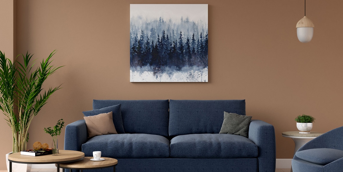
Summarizing some other issues: As you will see, you can add the brown color with wooden furniture, or also with textiles in this tone. The color blue has many shades, from turquoise to the darkest navy blue, and we can paint furniture and walls or add it to simple textiles, such as cushions and armchairs. These salons will show you how well these two shades combine.
If you want everything to have a very mediterranean look, you can add a lot of white color to spaces. Touches of blue and brown in the textiles are more than enough to bring life to every corner of the room. You have materials like raffia that are very natural and in warm tones to combine with those blues.

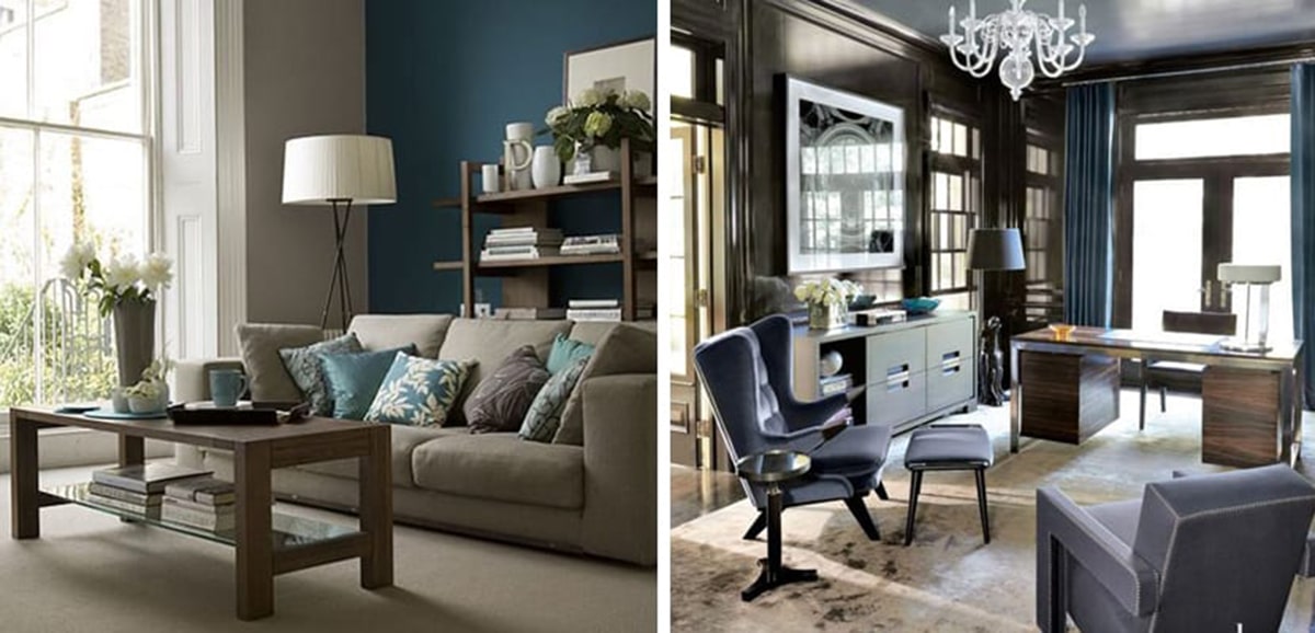
A sofa in chocolate brown tones is the perfect mix for strong blue walls. These two tones will stand out from each other, and you can also add more blue and gray tones in the textiles. It is a great combination for a fall or winter room. Although strong walls can be a risky idea, the final touch is original, and the deep chocolate brown stands out more with these complementary colors.
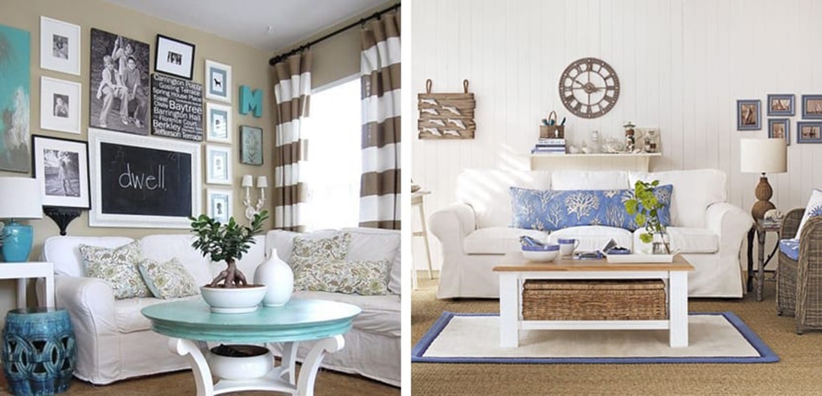
In these rooms we see a softer version, with a lot of white to give light. The wicker furniture provides a natural and very warm touch, and the simple textiles in blue and with prints give the freshest touch to the decoration. These types of rooms are perfect for spring or summer.