Apart from talking about design and trends, riding a Decoora we will also offer advice and tricks for home and to decorate your home with good taste in the most diverse styles, always looking for suitable solutions for every need.
We all know that color and its use are decisive elements when defining the decoration of the house. The first step is to define the color and then find the appropriate shade for your goal.

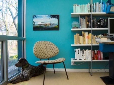
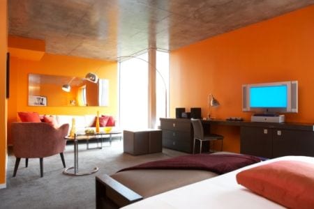
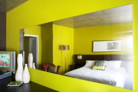
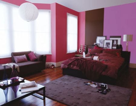
There are two large groups of colors: The warm and cold. In the successive photos of the article we will see the complementary pairs.
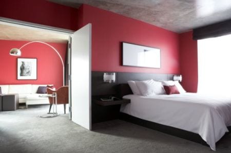
The warm colors include the yellow, orange y Red, while the cold colors van del Verde dark to violet, Through the azul. To achieve a result harmonic we will combine warm colors with warm colors and cool colors with cool tones. On the contrary, if what is desired is highlight a certain element is recommended mix both groups.
You can also opt for the traditional contrast between black and white, or use the option of the effect of white on white, since there is a wide variety of tones within this color. Finally, we must bear in mind that it is not advisable to use more than two or three colors in order to obtain a balanced and harmonious environment.
Before deciding the color to decorate the room, we must take into account aspects such as size, amount of light who receives or the direction the room is facing. For example, warm, bright colors are best suited for a north-facing home, while a south-facing home would be more accepting of bright colors and pastel tones.
Regarding the dimensions, in small rooms are more indicated cold colors, whites or even paper applications or vinyls on the wall, as long as it is applied sensibly and originally. On the other hand, if it is too wide a space you should use some vibrant and warm color at the same time, in order to achieve the effect that the walls appear closer to each other. Regarding light, for dimly lit environments are recommended cool colorsWhereas in very bright rooms they can be used warm colors to create a balanced atmosphere.
Regarding the color distributions for the different rooms, In the rooms are recommended more relaxing colors, soft y pastel tones. In the kitchen and dining room they can be carried strong colors and vibrant, like red and orange, as these whet the appetite. Colors such as lilac and blue are valid for bedrooms and living rooms as well as for bathrooms.

More tricks to play with colors: if a lighter tone on the ceiling than on the walls will cause the feeling that the ceiling is higher. On the contrary, if what is desired is conceal a ceiling that is too high we must use a Dark color. Another very useful resource is to apply stripes for modify the perception of space. Elongated stripes convey a sense of depth, while narrow stripes create a sense of greater height. The Light colors make the furniture appear larger and dark conceal bulky shapes.
I like green because it looks very striking
very cute