
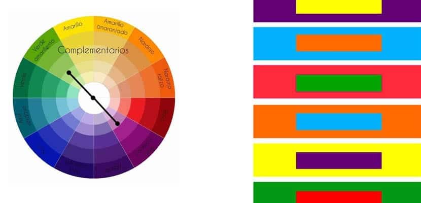
One of our objectives in Decoora is that we learn together the keys to color. For this, it is essential to know the chromatic circle, a correlative representation of the primary and secondary colors that starts from red and continues through orange, yellow, green, blue and violet.
El chromatic circle It is an essential tool for every decorator. Thanks to it we can quickly visualize which colors are analogous or complementary and choose the most appropriate combination to decorate a certain combination. Today we delve into complementary colors. Do you want to know where and how to use them?
What are complementary colors?
Red / green, yellow / purple and blue / orange are opposite or complementary colors. Colors that are in an opposable position within the chromatic circle and whose combination is successful when you want to add dynamism to a space.
How and where to use them?
Dynamism That these color combinations bring to a certain space is a feature that especially the children's bedroom, a family room or a creative study among other rooms benefit from. But they can also be used, avoiding the more vibrant versions, in other spaces with success.
When betting on this type of combination it is advisable to choose one of the colors as main color and use the other sparingly, in textiles and small accessories, so that it is not excessive. Adding white and other neutrals to the equation would also achieve the same effect: soften and lighten the final result.
Popular combinations
As we have already advanced, red / green, yellow / purple and blue / orange make up some of the most popular combinations to give color to our home. Reflect on how the room will be used and the influence What one color or another will have in us will be the key to choosing the most appropriate one.

I'm sure you've all heard about the psychology of color and the weight that this has when decorating the different rooms of our house. Regardless of our preferences, each color influences our mood in a different way. Do you want to know what characteristics are attributed to each of them?
- Green: Stimulates feelings of harmony and peace. Bright greens create a refreshing atmosphere, while softer greens create a calming effect.
- Blue: It is associated with tranquility, serenity and introspection. In its coldest shades, it suppresses the appetite and stimulates thought.
- Violet: An artistic color, linked to meditation, spiritual and ritual. Also to elegance and power. Soft hues have a powerful sedative effect, while darker ones are dramatic.
- Yellow: It brings vitality to spaces and awakens the intellect. The lighter shades bring light and create a relaxed and calm atmosphere. The more intense tones, on the other hand, activate us and it is preferable to use them in spaces illuminated with artificial light and reduced.
- Red: It is associated with passion and emotion and as such should be used in moderation.
- Orange: Brings optimism and a feeling of warmth and well-being. It also stimulates conversations, the exchange of ideas and the appetite.
Green and red
And not red and green because, as we have already anticipated, red is better used in moderation. This complementary color combination is used primarily to decorate living rooms and libraries. They are chosen for this purpose soft but deep greens Applied on the wall or on the main furniture, they bring serenity to the room and are combined with small red furniture and accessories that inevitably become the center of attention.
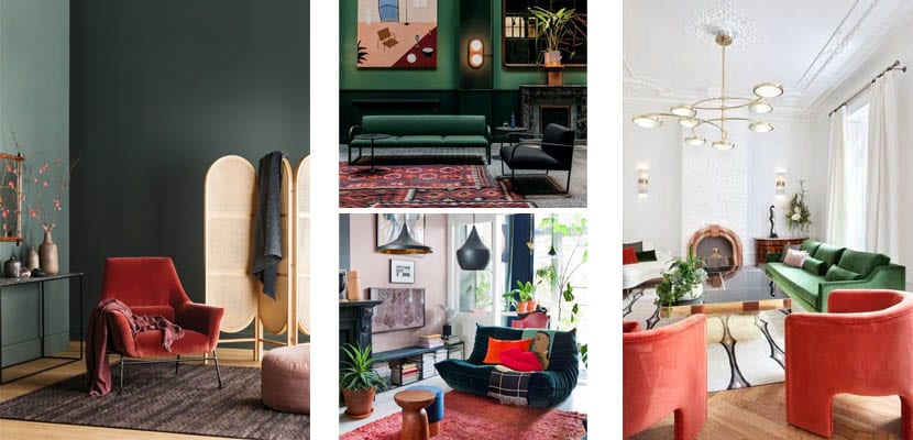
It's a bold combination that can be softened by using white as the third color. Applying this on the walls, we will achieve stays more luminous and friendly for the guests. Incorporate green through a large sofa and some plants and combine it with a red carpet or armchairs. You will achieve a daring and modern stay.
Yellow and violet
Yellow is generally an ideal color for kitchens and studios, however, its combination with lilac is more common in bedrooms and family rooms. Choose light shades that bring light and create a relaxed and calm atmosphere for the bedroom and use them sparingly combined with lavenders. Do you prefer a more bohemian atmosphere? Then the intensity of the violet goes up.
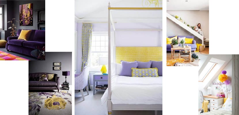
You can be more daring when decorating the living room, choosing a dark purple to add depth to the room and a vibrant yellow. Go for a large purple sofa and yellow cushions and incorporate gray or white into the equation. The first will contribute elegance and drama to the stay; the second, luminosity and freshness.
Blue and orange
The same thing happens with blue and orange as with green and red: it is difficult to find a space in which orange behaves as the main color. This is usually presented in small furniture and / or accessories, reserving blue for walls and large furniture. The orange takes care of bring modernity and warmth to spaces that could otherwise be classic and cold.
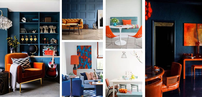
As a general rule, the most intense shades of blue are excellent for decorating bookstores, studios and game rooms. The lighter blues, meanwhile, are welcome in family rooms and dining rooms, in the latter in small doses.
Are you now more clear about how to use complementary colors in your home decoration?