
If you like certain styles or simply fashion, surely you have heard of the mint color. A tone that has always been there, but when it became fashionable it received this name, because it resembles the mint tone. East mint color It is used a lot in Nordic environments and that is where the trend comes from, but it has also been used a lot in fashion.
If you like soft and luminous tones For the home, this color is ideal to decorate the environments of the house, both on the walls and in small details that you want to add to the spaces. It is a color that has been a trend for a long time but that we must also know how to incorporate into our home.
What is mint color
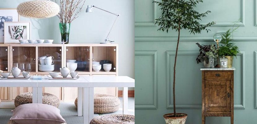
The mint color is a pastel green shade. In the softer tone range We find this green so fresh that it is perfect for giving color to spaces without taking away light. This denomination of the color is something recent, since it appeared when it became a trend in fashion and decoration. Pastel tones are colors of a much softer range, with less color saturation, and in this case it is a green color tending to turquoise in its pastel range.
Mint color in children's spaces
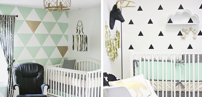
The mint color has become really popular in the children's spaces. This is so because the softer tones are ideal for children and their rooms, as they invite relaxation and create beautiful bright environments. This green color is often integrated into Scandinavian-style children's rooms. This style seeks to create bright and simple spaces, in which colors are hardly included and everything has a basic but very delicate and current appearance. In these rooms it is very common to use pastel colors and among them the mint green or mint we are talking about.
In children's rooms we can include this color in many ways. With small furniture to paint, or with decorative details. Another way to add this tone to the children's room is by painting part of the walls, never saturating with it. It is a color with a lot of personality but it must be used in its proper measure so that it does not tire us. The good thing about this shade is that it is a color that invites serenity, making it perfect for any home.
Mint color for the bathroom
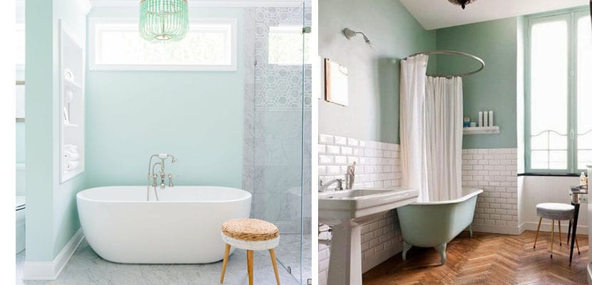
The bathroom is another place we can include this nice mint color. It is a color quite similar to turquoise although softer, so it is perfect for this area, since it links us with the water. It is also a fresh and bright tone. It is possible to put it on the tiles, or to include some type of furniture that carries it. It is also perfect for vintage bathrooms that we want to renew with a touch of trend. If you decide to add it to the bathroom, you can let it be the protagonist, mixing it only with basic tones such as gray or white.
Mint color in brush strokes

This color is perfect to give a cheerful touch to any corner of our house. In this sense we can add it in small brush strokes. If you can't find mint accessories in stores, you can always paint things you have around the house with paint in this tone. A vase, the legs of a stool or a small shelf can give everything a different touch. The key is to choose a few shades and basic basic colors such as white, which make this beautiful mint color stand out.
In any room we can make a piece of furniture the protagonist by adding this beautiful color. You may renovate that antique furniture of wood that you have at home with this new color. A chair, table, or nightstand in the children's room. It is a color that makes any piece stand out against a simple background.
Mixes for the mint color

There are ways and ways to add the mint color to our home, but we must always do it carefully. To begin with, it is important that this mint color is combined with other colors in its pastel range, so that they do not clash. In fact, if you add colors with more saturation, you will see that they do not go with mint green and that they do not complement each other. The ideal tones in this case are some such as light gray or light mustard or copper, which give it a contrast and warmth. The base tones are always going to be perfect for this color, like white, and sometimes it is also combined with black, although it is less common because it reduces its luminosity.
It's best to avoid adding too many colors to make pastel shades pop. It is possible to add furniture in natural wood but in the softest and lightest shades there are, which are the ones that combine well with mint green.